Close-up of two smartphones side by side on a minimal desk surface, each screen showing a bilingual website interface — one in Spanish, one in English — under soft natural window light, tight crop on the screens
/ Lo que entregamos

Tres servicios. Alcance claro. Sin sorpresas.

Arquitectura bilingüe, UX para móvil y build responsivo. Nada fuera de ese alcance — para que sepas exactamente qué estás comprando.

Tablet lying flat on a work desk showing a website with two language toggles visible in the navigation bar, natural daylight from the left, tight shot on the screen and keyboard edge
Hand holding a smartphone displaying a clean mobile website with large readable text and a prominent call-to-action button, soft natural window light from the right, background blurred workspace
Laptop and phone side-by-side on a minimal light desk, both screens showing the same website adapting its layout from wide to narrow, natural daylight, tight documentation-style framing
— Detalle de servicios

Qué incluye cada entrega
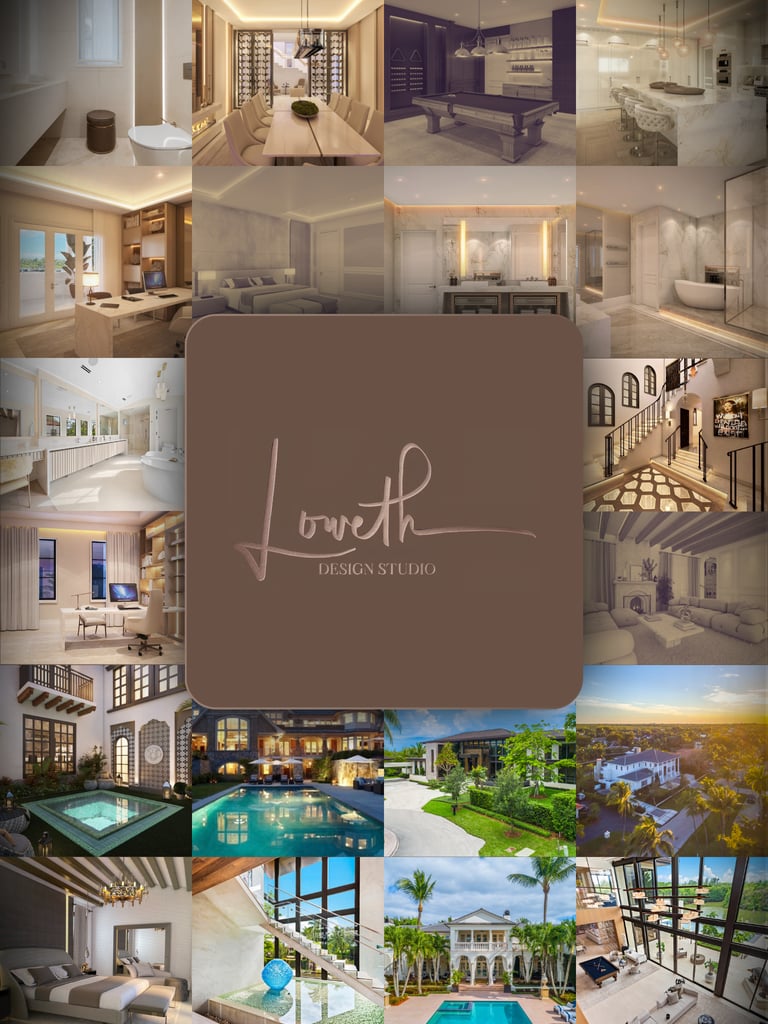
01 — Arquitectura bilingüe

Dos idiomas desde la base

La estructura del sitio se diseña para dos idiomas desde el primer wireframe. Rutas, metadatos, contenido editorial y flujos de conversión — todo nativo en español e inglés, sin traducciones pegadas encima.

02 — UX móvil primero

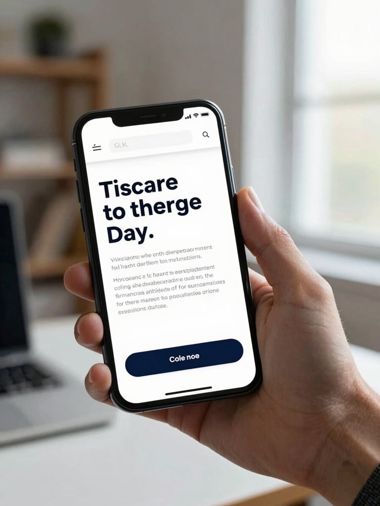
Diseñado para el teléfono de tu cliente

Los wireframes parten del móvil. Tipografía legible, botones alcanzables con el pulgar, formularios que no frustran. El escritorio es la adaptación, no el punto de partida.

03 — Build responsivo

Un sitio que funciona en cualquier pantalla

El build se entrega probado en los dispositivos reales que usa tu mercado. Velocidad de carga, accesibilidad básica y compatibilidad con los navegadores más usados en América Latina y España.

Wide shot of a minimal designer's desk with a notebook open to a wireframe sketch, a phone beside it showing a site in progress, window light from the left, no person visible, documentation feel
+ Cómo trabajamos

El proceso en tu idioma de trabajo

1. Diagnóstico — Revisamos tu sitio actual o tu brief en español o inglés, según prefieras.

2. Arquitectura — Definimos rutas, idiomas y flujos antes de diseñar una sola pantalla.

3. Diseño y build — Wireframes, UI y desarrollo responsivo con revisiones por WhatsApp.

4. Entrega — Pruebas en dispositivos reales, documentación y soporte post-lanzamiento.

Tarifas para PYMES

Presupuesto estructurado para tu mercado

Sin paquetes de agencia enterprise ni tarifas de freelance sin estructura. Tres niveles claros: sitio de una lengua, bilingüe, o bilingüe con integración de WhatsApp. Presupuesto exacto tras el diagnóstico.